Purchase experience Rate & Review
Brief
UX process: discovery sessions, ideation, wire framing and documentation, show & tell. Helping to prepare the User testing sessions.
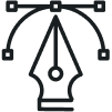
Fingertips is an in-house bespoke responsive web platform for Digital Operations in GECO (Vodafone Group Enterprise). Its target is to put Vodafone’s data at your fingertips in a real-time, transparent, and rapid manner to maximize your efficiency and productivity. As part of the improvement of the Fingertips platform, there was the need to redesign the Dashboard.
Research
The methods were a mix of qualitative and quantitative data.
We used the tool Hotjar to help us understand the performance of the pages.
The qualitative approach was by interviewing some participants and asking for some feedback.
Gathering feedback & insights
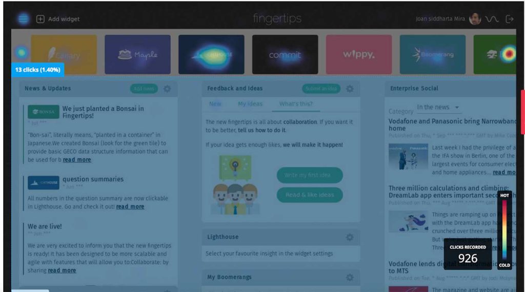
Hotjar and Heatmap
As part of the Research phase, we used Hotjar to create a Heatmap, to find out how good was the usability, and also which content types mattered most. Users were interacting with the Dashboard tool, we can see that the main areas clicked are the thumbnails of each app.
We used Hotjar to invite participants, we ended up with a list of 55 participants. This way we could implement regular user testing every two weeks, having our groups, all employees from Vodafone.
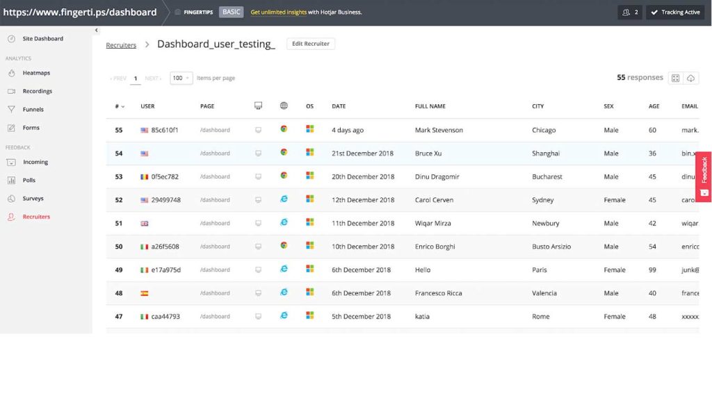
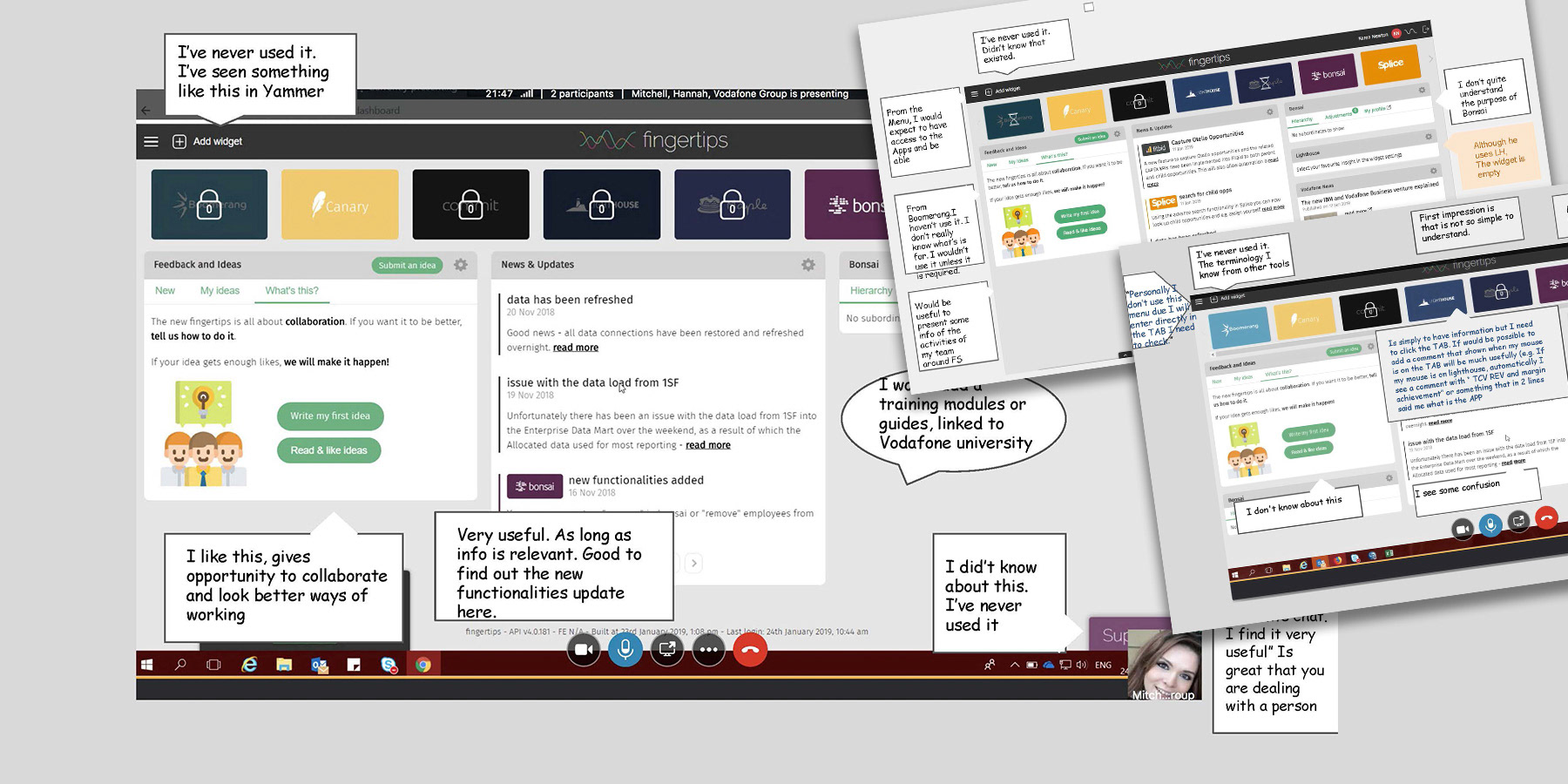
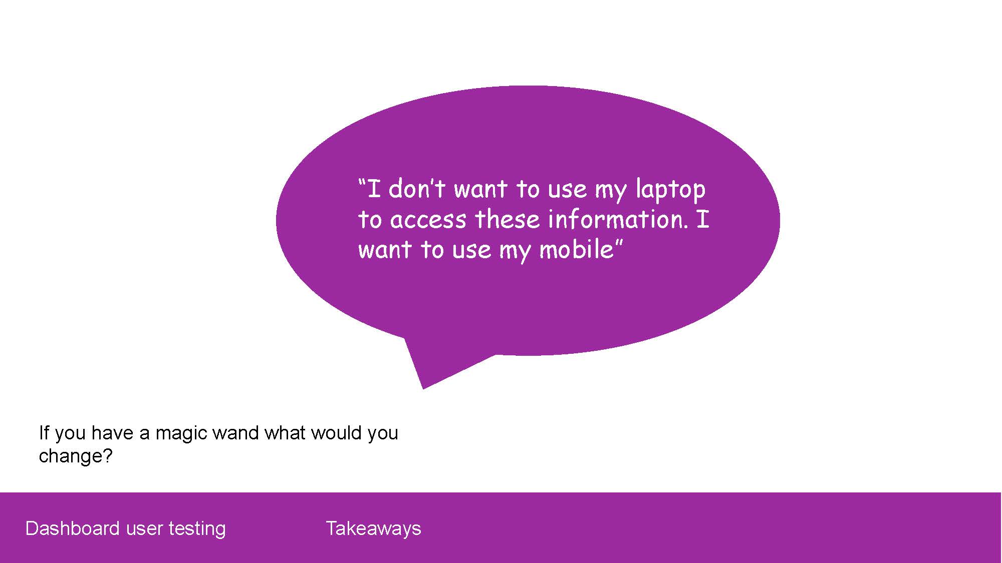
We did user testing from the current design of the Dashboard, to find insights, and pain points and learn about how the users were using it. We invited 6 people to the test, above you can see some of the feedback that was given.
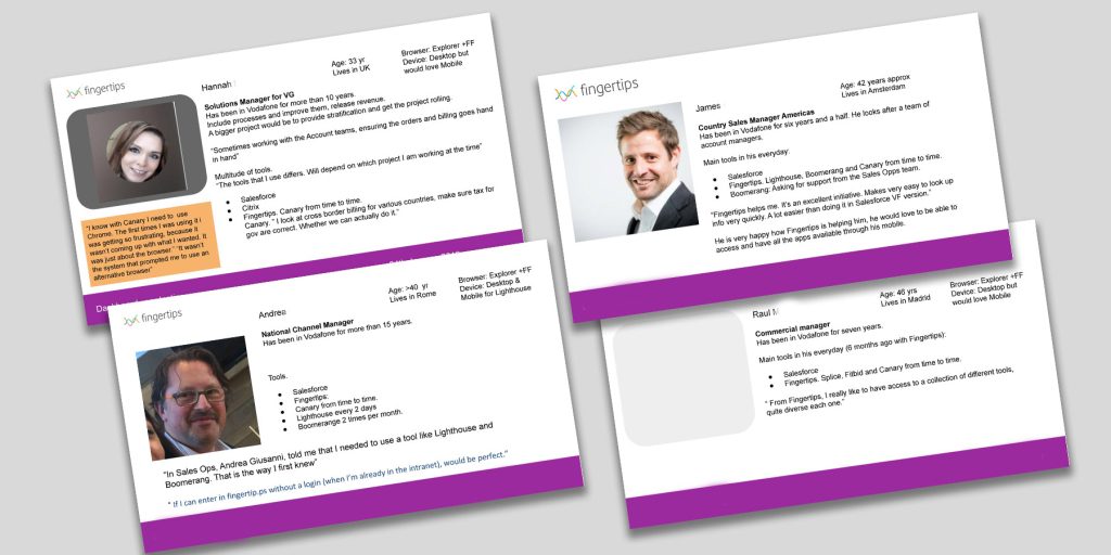
Find here on the top some exercises around building personas. Helping the Product team to understand who are our customers – users, and how can we help them to be more satisfied around the Fingertips platform.
Design
After the Research we had a good mix of business and user goals:
– Ensuring that has great usability and legibility
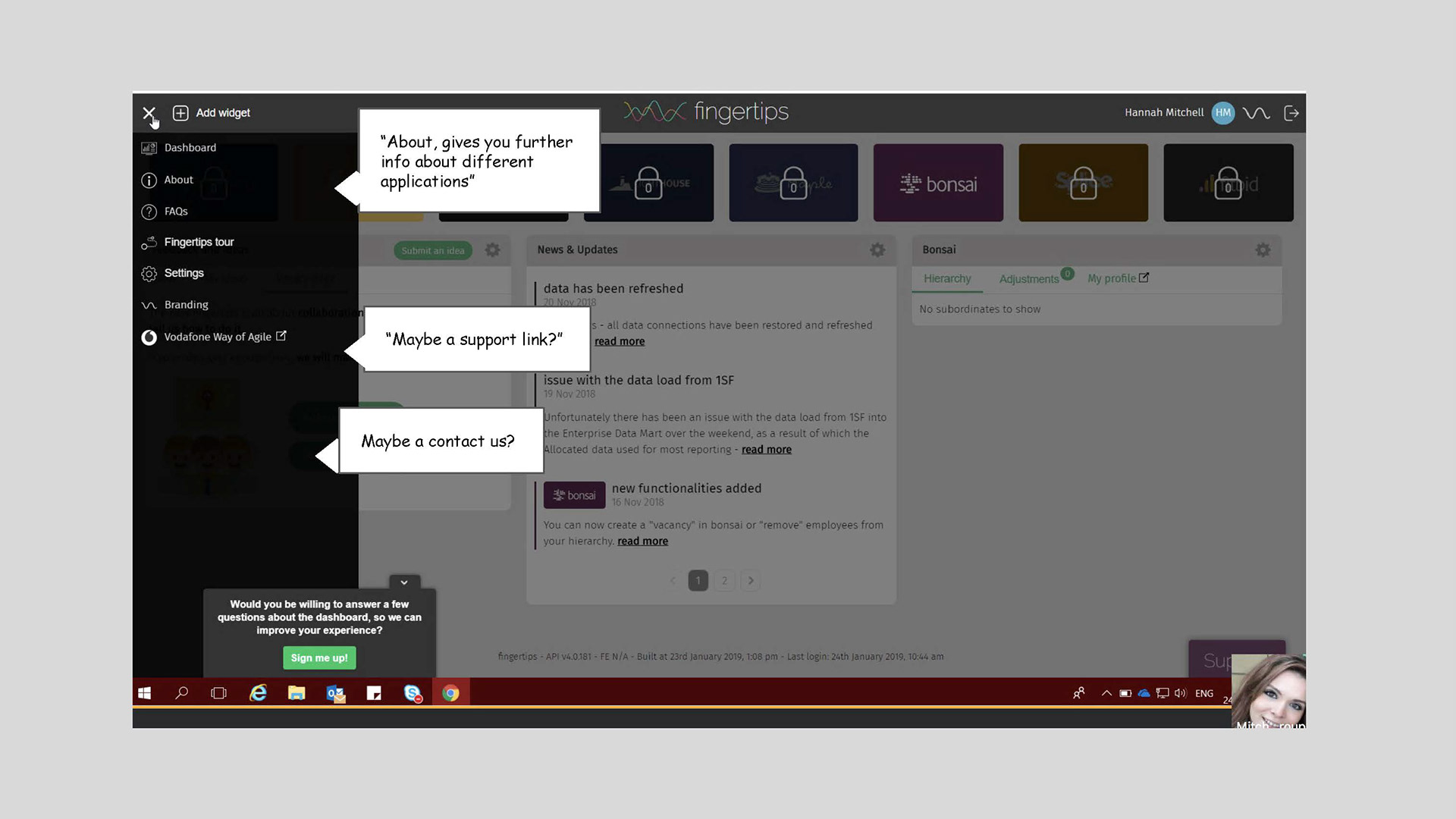
– Removing frictions that currently has ( request access, FAQs )
– Primary actions are: request access to the app, access an app, view all apps, and ask for support.
They followed a Lean UX approach to iterate quickly.
– Visual language should be on the brand
I began with lo-fi paper drawings — had meetings with my teams to decide which were the adequate designs, and jumped into higher fidelity mobile prototypes until we all were happy to test among users.
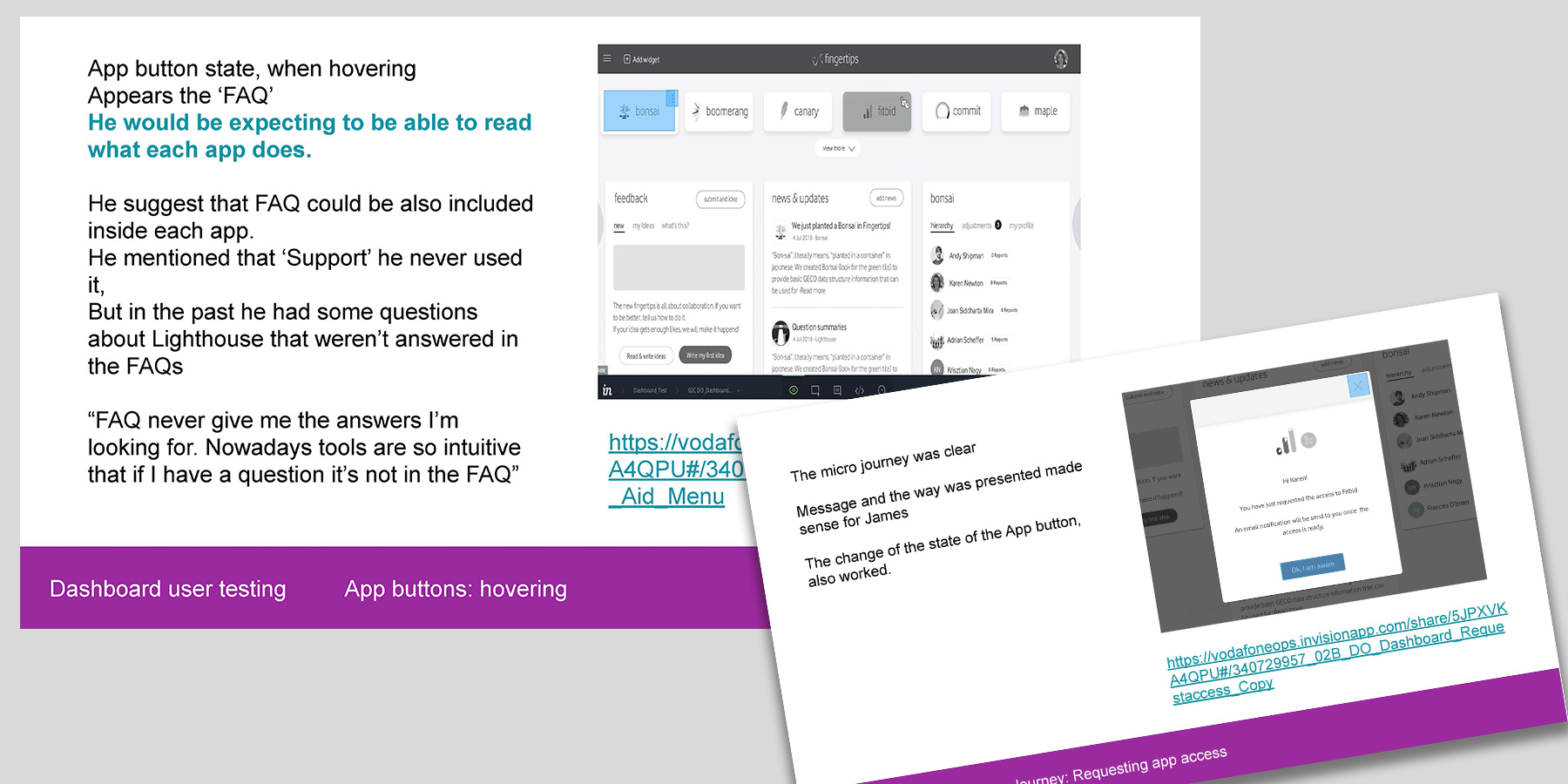
A new Design proposal was tested, with 6 participants. Above you can see screens of some of the user journeys and points that we wanted to clarify and some feedback.
I was responsible for creating and conducting moderate remote testing. Creating the script and inviting employees to the session.
The main areas to test were:
– Improve the visibility of all the apps available,
– Improve how to ask for access permission. The previous design was very confusing, users were lost in the way.
Visual Design, UI and Design systems
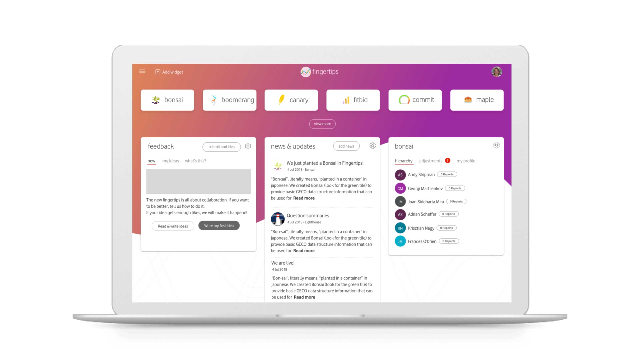
The problem that the re-design was trying to solve was the lack of consistency among the different apps, interactive patterns, and visual styles. Of having different patterns, components, and so many different styles, the experience wasn’t intuitive enough, and cognitive effort was higher than normal. Also, customers wouldn’t associate an app with the Fingertips family, as there were too many visual differences. The images below show a new visual language more connected with Vodafone, and trying to align all the apps. This work is related to the Design System that I helped to create.
UX process: discovery sessions, ideation, wire framing and documentation, show & tell. Helping to prepare the User testing sessions.
Project Details
UX design
- Collaborative workshops and reviews
- Exploration and innovation
- Landscape analysis and research
- Wireframes

- Annotated user journeys/flows
- Presentation of research and findings to key global stakeholders
- Stakeholder feature rule books
- Review and testing of the developed design